Saturday, May 18, 2024

M1 Intro to GIS Programming

L et us begin the whirlwind Summer tour of Python Coding with GIS Programming. The next two months will look at the integration of Python functions within GIS. This first week served as an introduction to the environment of Python and basic task flows that can be presented through standardized flow chart symbols. 

Lets look at a couple key terms before we continue. 

IDE = Integrated Development Environment

IDLE = Integrated Development and Learning Environment

Jupyter Notebook = another IDE

ArcGIS Notebook = derived from Jupyter for specific use within ArcGIS applications


Now, one key concept to ensure we get across is that Python is an interpreted language. This means that it has an associated translator which reads your input line by line and executes what the code is telling it in the same manner. The opposite is a compiled language which compiles the given syntax and converts it to a machine code which is then executed. Python, as an interpreted language, is by design easier, albeit slower to process, as it is linear, easier to debug if there are mistakes present, and is simplistic in execution as it either will or wont work. 

Python has default IDE's provided along side its installation, such as IDLE. But it also has numerous other graphic user interfaces (GUI) which can be used. Additionally, there are other interfaces which gain specific functionality such as the ArcGIS Notebook, which is a derivative of Jupyter Notebooks built specifically for use within ArcGIS Pro. We will predominately be using this throughout this course. 

Another key concept that we looked at this week is that of graphically representing an algorithmic process through a flow chart. The flow diagram below is fairly simple, it involves 3 different inputs and a specific deliverable. 

In its case we want to convert 3 radians of a circle into degrees. As such we can look at this concept in pseudocode, which is a word based representation of instructions which we could translate into python. Or we can pictographically look at it as has been done below. 


Overall, this week has been concept heavy with simple outputs. Next we will be looking into understanding the specific breakdowns of python code in what make our scripts work. Thank you. 

v/r

Brandon


Monday, April 29, 2024

Cartography - Module 7 - Google Earth

 Welcome,

It doesn't feel like this should be the end, we arrived here ever so quickly. But it is, the end of this half semester. This week involves a bit of collaboration between tools. That is, some initial work in ArcGIS Pro, with some display and refining in Google Earth.

ArcGIS Pro can export feature classes and layers into Key Markup Language (KML) which is readable and displayable by Google Earth amongst others. The map below is a combination of KML layers output from ArcGIS Pro and then input into Google Earth. This is all to get after some of our last learning objectives. To not only use these conversion tools, but to demonstrate some of the software interoperability that's present in both. 

Google Earth can do more than present the KML information, you can then add to it. In the below case we can see an added legend utilizing the ability to overlay images within Google Earth. Also place markers can be used to then explore your graphics even more. Ultimately the below is the culmination of three different layers, a point layer and two polygon layers (displayed in different ways, water vs, county outlines) exported and then presented within Google Earth. Not displayed here is the tour that was taken after involving the tour recording feature. One of the keys here is that an audience may more readily understand looking at Google Earth or Google Maps than they would a deliverable from ArcGIS Pro itself. This allows us to add even more locational realism and exploration capabilities to our presentation, with the map below being a small taste. 


Note that the water features and dot map are only for the southern half of Florida. The original intent was for the lower 27 counties specifically. But for better context I still wanted to show the whole of Florida for an initial look. Regardless, the key here is a demonstration of some of the collaborative capabilities these different platforms can have. We will see you in the next class, and work toward carrying all of these principles forward. 

Thank you! 

v/r

Brandon


Friday, April 26, 2024

Cartography, Module 6 - Isarithmic Maps

Greetings all,

There's several topics and discussion points to get after understanding the map below. In unexplained terms we can throw together the following: interpolation, continuous, hypsometric, contours, and hillshade to name most of them. Learning and employing these terms, and how to employ the concept they represent is the subject of this map. Lets look at those first before we get to the map below.

Interpolation... or how we take known data points and then provide a smooth surface of data points for the areas between known points. In the map belows case, the method of interpolation is called PRISM (Parameter-Elevation Regression on Independent Slopes Model). This model prioritizes elevation but takes into account major terrain and other factors which affect climate patterns. It takes the known data points and weighs it against all other locations and associated terrain to create a value for all other locations. This looks at the relationship between precipitation, elevation, and landscape changes, including slope, rain shadowing, and difference between leeward and windward sides of the mountainous areas.

Continuous vice Hypsometric Tints. Continuous tone symbology is one of the two types of symbology approaches we discuss in this module that are appropriate for smooth, continuous data phenomena such as rainfall which is the subject of the map below. The approach applies a shaded or colored tone corresponding to the data value of each pixel. This continuous scale provides smoother appearance than hypsometric tinting, because it is not stepped. Hypsometric tinting is the other method of symbolization discussed in this module which is appropriate for isarithmic maps which again revolve around smooth, continuous phenomena. This approach enhances the ability to visualize 3-D surfaces with color schemes that are stepped or associated with a classed range of values. This can be used with or without contour lines. Within the final map there are numerous classes of data but the baseline color scheme is the same as that above, dark for drier areas, green – blue for wetter areas.

The other thing not yet discussed is contouring and hillshade effect. The map below has contour lines to help break out the hypsometric color classes, and has an overlying hillshade effect which is designed to provide a greater sense of the elevation relief of the region. 


As you can see, the subject area is Washington State, and this map breaks out precipitation by average over a 30 year period. Note the stepped approach to showing the different inch classes of rain fall. The shadows within the map are the added hillshade effect to help highlight the terrain relief. You can see that this method helps highlight these mountainous areas where rainfall is concentrated. 

Thank you.

v/r

Brandon


Wednesday, April 17, 2024

Cartography Module 5 - Choropleth and Graduated Symbols

 Greetings,

Welcome to Choropleth week. This is the type of thematic map that we are dealing with this year. The subject area is central Europe and we are looking at two primary factors. First and underlying everything, population density, which is the blue hued sequential color scheme on the map below. Second is a look at wine consumption by country through the use of graduated symbols highlight a consumption range of liters per capita. 

The overall objectives of this module are to appropriately employ both the choropleth and symbology methodology. This is accomplished while also working with a data set that has more information than needs to be or can be displayed. For example, there are several countries of negligible size and wine consumption when viewed at the scale provided. As such they are omitted from the presentation, also some known outliers have been removed. 

What's left is a map that explores data standardization and display customization while employing all of the standard map elements. My overall goal was to maximize the size presentation of the subject countries while also providing as clear a picture of the two mapped factors. The final map is presented below. 


Looking at the map, the colors are what we care about. The white to blue and red. That is your mapped data, the gray scale underlying everything else is all background or supporting information kept slightly out of focus. You can see that some of the information becomes jumbled, so an inset is also employed to highlight a conglomeration of numerous countries together. 

Also as an aside, but learning point for the module, you can see on the bottom, slightly left, the projection information. Why is this important? 

Well,  the Albers Equal Area Conic projection is particularly good for areas such as this because as its name suggests it retains the area for the region. Possibly more importantly it has relatively little distortion between the standard parallels used to make out the conic shape. This is better suited to wider regions like our section of Europe. We have a larger east-west section than north-south. Preserving the area is also particularly important because of using the population density which is a measure of population across Square Kilometer, so we want the countries themselves which are the enumeration unit to have as accurate an area as able. Then our final map also should look undistorted, thus this projection provides a good balance even though shape and conformality aren’t strictly maintained. By providing the projection on the map an observer can then glean that information on how this image and data was processed.

Thank you.

v/r

Brandon


Wednesday, April 10, 2024

Cartography Module 4, Data Classification

Greetings everyone,

Data classification methods are the name of the game this week. this is a part of our next couple of modules which are investigating different types of thematic maps. For this week though we aren't focusing as much on the thematic type, but the data classification methodology used to display the data set. Additionally, we continue to build upon the design principles of the previous modules. The key learning objectives though revolve around demonstrating differences between the 4 different methods presented below. 

The subject area is Miami Dade County in southern Florida with the subject matter being the percentage of population above age 65 per census tract. Also, the raw number of members above age 65 normalized by square mile is also presented. Before we look into those, a touch on the 4 classification methods. 

Equal Interval - This classification method takes the range of data values (Max – Min Value) and divides it by the desired number of classes. For example, values of 0 to 100 with 5 desired classes would equate to each class representing an increment of 20. One thing this doesn’t take into account is how the data is distributed along a number line. It could result to classes with no values in them, and classes with large amounts of values compared to the others. However there are no gaps in the legend, but there may be some visual gaps if there are segments without values.

Quantiles - This classification method separates your data into an equal number of observations per class. First, the data is rank ordered from lowest to highest or vice versa and then observations are dispersed into your classes until all classes hold an equal amount of observations in the ascending or descending order. One potential problem is that this method does not take into account data clustering or the natural break points observed as you can see when placing the data on a number line. A positive is that there will be no empty classes within your map.

Standard Deviation - This classification method is best for data which is approximately normally distributed along the number line. Provided the data follows the bell curve model or rather has roughly equal amounts of data along both sides of the mean it will represent well. One problem if the data is not equally distributed is that you’re likely to have a skewed presentation with empty or misrepresented color classes.

Jenks Natural Breaks - This classification method also takes into account where the data is along the number line, but tries to group data items based on where they occur most frequently. This attempts to group like values together and unlike values in separate classes through a best fit algorithm.

Presentation 1. 


Presentation 2. 


Discussing the two approaches above I came to the following conclusion. Utilizing the population above age 65, normalized by square mile provides a more accurate picture of this population. A similar argument as to the question 8 can be made for this normalized view of the data. The Jenks Natural Breaks method is still the most desirable due to how it captures the highest data class. The information that is more useful here is that it can show you an actual accounting of how many citizens could be reached per tract. In this case, the central area has tracts that mostly contain 3500 – 7120 people. This could then also be used to judge return on investment from discussions with this demographic.

This method also eliminates some of the skewed nature of some of the surrounding tracts. With the number of individuals being presented you can better account for actual tract population for the desired demographic. With the percentage method you could have a much smaller population in total for a tract, but the senior citizen population be a larger percentage. For example, a tract with 100 people in it, 60 of which are senior citizens, would show in the highest percentage class for the percent method. However, a tract with 1000 people and only 300 seniors, would show a lower percentage total, but by the number method would be more valuable to target. 

Thursday, April 4, 2024

Cartography, 5007, Mod 3 - Design

 Greetings and welcome to module 3. 

The lab portion of this module is built around employing the Gestalt Principles of Design. Classically, there are 8 of these, but we will distill them into the concepts outlined below. 

1. Intellectual Hierarchy
2. Visual Hierarchy
3. Contrast
4. Figure-Ground
5. Balance

The lab also continues building upon the labeling and organizational elements that were employed in the previous lab. The lab and map shown below were created entirely within ArcGIS Pro with the goal of based employing the principles above. All data was provided, but all design choices were my own. 

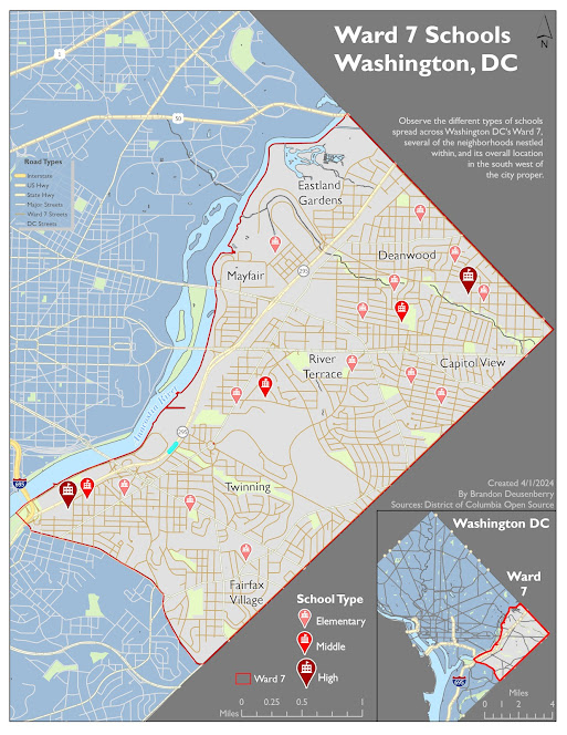
The subject area for the lab is Washington DC, specifically Ward 7. This war makes up the eastern point of the DC area. The goal was to highlight all schools within Ward 7 and organize them by type. As such you can see elementary, middle, and high schools all distinctively broken out. They are based off the same location pin symbol, but the type of school changes in size and color intensity based on the type of school. High schools are the largest and darkest symbol, whereas elementary schools are the smallest and lightest of the pins. However, taken together they are still more noticeable than background features. This is one example of the features discussed above and further discussed below the map. 


I have implemented visual hierarchy in my map in multiple ways. Chiefly, the most notable features are the Schools themselves, followed by the distinguishable border for the subject area. Then I have also applied hierarchical principles to the other elements such as the Title being most emphasized through size characteristics and other text items having less emphasis, but still being more visible than other items. Did you notice the secondary legend for the road types? Its not absolutely essential nor the focus of the map, but it is present should you be looking around those areas.

Ward 7 is the figure to all the other ground around it. Ward 7 is a lighter area on the map, more so than the rest of Washington DC which is a darker blue, just to break up all of the gray contrast. And areas outside of Washington are darker still. Additionally, the subject area streets contrast against the streets outside of ward 7. 

For balance note, Ward 7 comes to a point on the East (right) side of the map.  This divides and leaves two open triangular background areas for use of ancillary elements. Not that these areas are almost the same size, with a slight favor to the lower right one. I wanted this area to be slightly heavier, adding more gravity to the image, by placing the primary legend and map inset there. But to balance the subtle size difference, the title in the upper right is the largest heaviest font on the page. The focus area is still specifically centered on the page with elements being semi equally distributed around it. The secondary area in the main map which is mostly just Washington Roads, does have a secondary legend which helps provide more usefulness to the area than simply unlabeled cityscape.  

Thank you much

v/r

Brandon

Thursday, March 28, 2024

Cartography 5007, Mod 2 - Typography

 Welcome to Module 2.

 The focus of this module is on an introduction to the essential map elements, with emphasis on typography. That is, appropriate labeling conventions, principles, and design choices with relatively simple subject matter for the display of these elements. 

First, what are the essential elements? They include but aren't always limited to the following: 

Title, Scale Bar, Legend, Orientation, Frame or Neatline, Composition Information (Cartographer, Data Sources, Date).

All of these elements are presented in the map below, and in future modules we will start adding things like graticules, gridlines or other locational aides. But before getting into the map, a few key notes about typography. 

 The objectives here were to understand and employ different types of labels for different feature types. Specifically, points, lines, and area features. Each of these is represented through the Cities, Rivers, and Marshes presented in the map below. Each of these also has unique considerations for effective labeling. 

  • Point features have a hierarchy of positioning starting with the upper right of the point, and working from upper to lower on either side or top central and bottom central. 
  • Line features can have subtle curving or tilting to contour to the line itself, so long as the label NEVER ends up upside down. 
  • Area features may be large enough to fully encompass the label in a centralized manner, or it may be such that the label is external and has a tail to connect it to the areal feature. 
Regardless of the feature, there are some background factors to take into account. We want to avoid placing labels over or in the way of multiple elements on the map. The placement of one should not overlap or obscure another element. Condensed areas should include inset maps or other tails to call out specific items. 

Then there are specific design characteristics for the labels. for example, the usage of different font types, including serifs or not, that is the pointed tails at the end of the swish of letters. to be bold, italic, or haloed. Different types of font applications call for different emphases. In the map below, I have used Gil Sans as my primary non-serifed font choice. Italics only show up for the water features. In terms of recognizability, the Capital, County Seats, Marshes, and then Rivers are designed to be noticed in that order. This is accomplished through changes in font size as well as halos and color blending with background features to deemphasize some things from others. 


Florida is the emphasis for this map, with several larger cities (specifically the county seats) being highlighted. Additionally, numerous significant rivers and swamplands are also depicted. To help provide emphasis to certain features I utilized the following customizations. A star represents the capital, as well it should. It has larger text but is still in the same font style as the county seats. Another key design choice, I can't help but think of Green when thinking of Florida, so the general background color for the Florida Counties is a light grassy green. But to provide emphasis and more country context for Florida itself I added a blue background for the Gulf of Mexico and Atlantic Ocean. I also utilized a bland gray for the immediately adjoining states that are in the frame.

For label designs, the rivers have the most unique modifications. These involved adjusting individual vertex points to allow for the words to flow along the general pathing of the numerous snake-like riverways. There is also significant free space not being utilized in the Gulf of Mexico area, so to keep it from being too empty I added a text description of the map focus there. I also particularly like the contrast of the green Florida, blue water, and tan title and legend areas. 

Thank you.

v/r

Brandon

M1 Intro to GIS Programming

L et us begin the whirlwind Summer tour of Python Coding with GIS Programming. The next two months will look at the integration of Python fu...