Showing posts with label GIS 5050. Show all posts

Saturday, October 14, 2023

GIS 5050 Final Project - Bobwhite Manatee Transmission Line

 Welcome to the culminating event of the class, the final project. This was certainly a lot of work in a short period of time. The primary subject of the final was an analysis of the Bobwhite - Manatee Transmission Line which was a Florida Power and Light initiative to bridge Manatee and Sarasota counties power needs with a new 230Kv transmission line. Before I get too indepth with the project or its deliverables, I will highlight that I have a 32 minute long presentation linked below. Additionally, the presentation and slide by slide narrative are all available right here. Then we will discuss some key areas below. 

Final Project Video Presentation

Final Project Presentation PDF

Final Project Slide Commentary

The overarching purpose of this project was to perform a suitability analysis on this already complete project. It was started in 2006, and completed sometime in 2022, or so my sources show. but, using GIS principles and skills, can we validate and or recreate some of the forethought analyses that went into this project to determine if it meets the following criteria: minimal impacts on homes and homeowners, minimal school impacts, avoids negative impacts for parcel owners, and conservation areas, and is the overall line length affordable? 

To answer these, several different analyses were performed. Each of which generated some map elements that feed the presentation linked above. 

Lets first take a look at the base map. 


The primary highlight here is that we are looking at Manatee and Sarasota Counties in Florida, and have several different looks at the Preferred Corridor outlined in red, which is within an overall project study area, the rectangle in blue. 

Next let's look at each of our objective criteria: conservation lands interaction, homes, schools, parcel impacts, and then the overall length.


The key here was defining the intersection between the conservation areas and the preferred corridor. And also breaking down the whole of the corridor into wet and dry land. All of these were then taken into account as they defined the environmental impacts to this region. 

Changing gears and toolsets we will look at the impacts on homes. 


This process involved utilizing the reference imagery to populate a feature class shell with home locations across the preferred corridor. This map also introduces a 400-foot buffer around the preferred corridor, which was used to identify homes inside the corridor, and those still in close proximity but outside. 

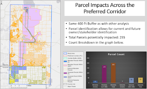
Following this I looked at parcel interactions with the preferred corridor.


This map and graphic breaks down parcels that are completely contained by the preferred corridor, and those that merely intersect it. Utilizing the select by location feature and defining that within vs connecting relationship allows us to identify all of the impacted parcels so that a more accurate list of stakeholders can be generated. 

Next we had to look at school considerations. 


This is my least favorite aesthetically. It is a very simplistic overview of school clusters across the counties. Only 5 of which are located within the study area, and none of which are in the preferred corridor. This would suggest there is negligible school impacts. However, despite that, this was one of the most involved processes to generate this map view. 

Specifically, the school data have to be obtained from the Florida Department of Education, then converted into a useable tabular format. Separately, line information for the counties was acquired and put into an address locator. This locator when married with the tabular school data created a geocoded schools layer, which is all of the points you see here. 

From there, the final look is at the length of the corridor. 


This one was fairly entertaining to create. Even though its a simpler view than the above, finding ways to transform the polygon-based preferred corridor into a center line, in order to calculate the overall length was interesting. Ultimately we can see that a direct start-to-finish line only covers 18 miles, but the circuitous route that the corridor takes adds several miles. Up to approximately 25. 

Taking all of the images together into account we can paint the picture that the multiple bends, offsets, and adjustments to the line is what really makes it work. While it is a longer path from start to finish this way, it very well does minimize as many impacts as possible. 

For a much more thorough discussion on this process and project, please watch the presentation linked above. Thank you. 


v/r

Brandon

Thursday, October 5, 2023

Georeferencing the UWF Campus

     As with each of the labs in this course, there were multiple different exercises to undertake. They all centered around the UWF main campus outside Pensacola Florida. While previous labs worked toward building data layers, this one focused on taking unreferenced or unregistered raster (imagery) layers and applying point features that could give specific spatial reference for the image. For example, we had a known buildings and roads feature set which were used as the reference layers. And then we took satellite imagery of UWF, and established control points to link the imagery to known features. 

Once the imagery was registered to the reference layer with the control points, new features needed to be added or digitized to the buildings and roads layers. The main frame on the left side of the image below illustrates the combination of two satellite images, which were registered through two different transformation methods, then building 72 and Campus Lane were added and specifically highlighted. Additionally, a significant feature adjacent to the campus is a local Eagle nest. Buffer easements have been applied to that location as well. 


Overall there is a significant amount of information in this map, but hopefully, it can all be understood. Additionally, for a look at the eagle nest itself, you can reference this link: UWF Eagle Nest

Taking the georectified imagery a step further, we wanted to add elevation data to be able to do some 3D modeling of the campus region.  Light Detection and Ranging, or LiDAR, is a way in which to generate elevation data for a particular area by using emitted radiation from a laser to catalog and organize received ranging information to generate a 3D surface based on processed ranging data. In this case, the data was supplied by the National Map Viewer and clipped to our scene area for us. With it though, I created a Digital Elevation Model, and that underlays the imagery below. The image has been rotated to provide enhanced perspective but is otherwise much the same as the above, just laid on top of a new surface which highlights the changes in elevation. 


Georectifying imagery seems to be the more common place of the two tasks. But they were absolutely extensions of each other, with multiple lessons learned. Ultimately the accuracy of the process is based off of how good the technician can enter or associate points. Though there are numerous transformation options depending on the distortion of the imagery being used. 

This was an excellent exercise, which appropriately started bogging down ArcGIS Pro from all of the layers and shifts, and display features presented. Thank you. 


v/r

Brandon

Wednesday, September 27, 2023

Spatial Data and Geocoding

     What do you do when you can't find a ready made spatial data file or shapefile or feature class for what you are trying to do? You build it of course. This weeks lab was two fold. First, building tabular data using some known points originally in Latitude and Longitude, which needed conversion to decimal degrees for display and usage in ArcGIS. That was an exercise in taking some data points and building an excel file which would be the data for a new feature class. Second, taking other publicly available address data and geocoding it into ArcGIS. This involved formatting the known addresses, again into excel, and transitioning that tabular data into another feature class within ArcGIS Pro.

In both cases, ready-made feature classes were not a thing, and the exercise was in translating available information into that usable within ArcGIS. Both parts of the lab were also in different areas. The first of the below being known eagle nests in the vicinity of the University of West, Florida. The second being schools across Manatee County, FL. Thank you to the Florida Department of Education for the addresses for the known schools. 

Here is a look at the tabular data and resultant display for the eagles nests: 


The following is a look at the schools mapped across Manatee County. This result is also available publicly, hosted by ArcGIS Online at the following link:

Manatee Schools by Brandon


The challenge with this lab was the attention to detail with working in excel, and ensuring the formulas for data organization were appropriately entered. Making sure all of the headers were setup appropriately for the transition into ArcGIS online to be successful. Also I encountered some initial difficulties with running the address locator. This is a multi step process involving a specific tool which took the tabular data I created, and then matched it against the known map region to build point features based on address. Also, when data could not be matched, I relied upon finding the actual school within Google Maps, and then manually updating the point information for the geocoded results. 

Ultimately this is an incredibly useful process, and the exercise in manually geocoding is invaluable. Thank you. 


v/r

Brandon

Wednesday, September 20, 2023

Vector Analysis, De Soto National Park, Lab 4

     This was a process-centric week. Now while that may be every week and all projects, relying on a certain order of skills to be accomplished or performed to create an end result, this week absolutely revolved around learning some particular skill ordering. What is the process for changing, selecting, and creating a geodatabase? What are the various ways you can run a query to select specific features by particular attributes? What is the difference between a spatial join and a feature layer union? These are only a few of the questions answered by this week's lab on vector data analysis which was accomplished in two parts. 

Ultimately the focus of the exercises that answered the above questions was in findign a suitable camp site in the De Soto National park based on a number of road, water, and conservation area criteria. Overlay and buffer analysis tools, which are two of the most widely used and practical ArcGIS tools, were utilized to compare and overlap these features to qualitatively highlight potential campsite locations. That is the subject of the map below.


From the above I would say my primary critique with my work this week is the lack of centrally identifying characteristics with the park. That is a limitation of the originally provided data sets. while I could look more into the park, that was beyond the scope of this week. However I did need to find supplemental shapefiles for the inset overview, which came from the US Census Bureau's Tiger files. 

Also, I did deliberately put the inset in miles and the park in kilometers for the scale bar. The base data is in UTM and meters, which translated well to kilometers for the park itself. But for the average viewer i wanted them to be able to associate the larger overview region in miles, with a nice round number there, 100. 

The other aesthetic goal was to highlight larger areas as the priority for campsites. That is why the darker greens are the desired areas, and the smaller areas almost blend in with the background. This was a deliberate choice to down play them, but still have them discernable for those wanting that. 

This was a successful lab and served well at building an understanding of multiple tools and their uses in taking real data and providing an analysis for practical purposes. Thank you.

V/r


Brandon


Thursday, September 14, 2023

Collection and Projection, Lab 3

    This was a multi-subject lab week. For the first part, it combined some physical activity in and around my local neighborhood for in situ data point acquisition. Then the second part looked at what and how projections affect the presentation of data and maps. 

Part I. Field Mapping and Data Collection

The goal: collect data on safety features in my local neighborhood.
My target: fire hydrants in and around the common areas of my neighborhood.
The process: build a feature layer shell to house the collected information, host and sync the shell with ArcGIS Online, collect real-world point data with Arc Field Map from my phone, present. 

The brief process above makes it seen simpler than it was. This multi-software, multi-step process, played to the strengths of several different programs and methods. First, ArcGIS Pro was used to build the feature layer shell that would essentially be the data base organization tool for the collected data. then this was hosted on ArcGIS online in order to be able to sync both the computer software with the phone application used for collecting and storing the points, Arc Field Map. This was a particularly useful tool for collecting data. 

While I did all of my data collection connected to cell signal, it can be done offline instead. This is particularly useful for inside buildings or in other areas with limited or no signal. For the collection, 3 classes or condition categories were established. They are; excellent for like new condition, fair for some damage but overall functional, and poor being broken, damaged, in need of replacement. 

Once this was established, I walked all the way around the neighborhood and through the central common area. I identified 20 fire hydrants along this path. I identified 3 hydrants in the excellent category with brand-new fresh and shiny yellow paint with no cracking. Oppositely, there was only 1 poor-condition hydrant which had significant rusting, pitting, and worn hydrant nuts which could prevent them from being unscrewed in a timely manner during an emergency. The other 16 were in fair shape with some rust spots and cracking and peeling of paint, but otherwise, they should be completely functional. 

After collecting the points and reconnecting to Arc Online and ArcGIS Pro, the goal was to develop several different methods for sharing the collected data. These were through a Map Package from ArcGIS Pro, through Arc Onlines web maps, and also as an exported KML for use in Google Earth. The deliverable below is an example of the upload into Google Earth. Which KML sharing is one of the most useful and easiest sharing methods. However, for more interaction with the data itself, I would rely upon ArcGIS Pro or the Online Webmaps. 


Part II. Projections 

Map projections are the methods in which the spherical earth is transposed to a 2d or flat map. Different projections seek to retain different qualities of a map, such as the shape presented, or the area of a particular region or shape, or the linear distance and direction from one place to another depending on scale. 

In this part of the lab, a basic map of Florida divided into counties was given three different projections to compare differences and similarities. Surprise, Florida has the same shape in all three. However, there are slight differences to its orientation, that the scale below, unfortunately, doesn't highlight well. The UTM projection specifically has a slight skew counter clockwise of the others. The more prominent comparison is in the Area Table which highlights four counties spread across the state. These 4 counties show differences in size (miles squared) for each. You can see that the Albers and State Plane projections lend incredibly similar results. They range from nearly identical out to approx 3-4 square miles separate. Whereas the Albers and UTM projections provide the biggest differences, up to approximately 18 square miles difference for the larger southern counties of Polk and Miami-Dade.  

One of the primary goals here is to show the importance of having data sets or products with consistent projections to allow for accurate calculations and analysis. There are two potential projections issues. either having an inaccurate projection to the data, or having no projection information assigned at all. Arc GIS software does a great job at reprojecting on the fly, that is converting new layers to whatever the base projection of the project is. However, if there is no projection associated or Arc can't determine what it is, then it can provide erroneous results. 

This was also evidenced with a Raster (picture) dataset which had an 'unknown' projection, which when added to the base map, appeared drastically out of position. That is until the projection was defined for it, to then associate appropriately. Below is the end result map showing the three projections and adding a little of my own desired Red, White, and Blue flair. 


Ultimately, this was a fun experience working on many facets of data collection and depiction. While the two parts seem distinctly different, they are apart of the full understanding and generation of a broader project from nothing to full depiction. Onward to the next project. 

V/r

Brandon

Monday, September 4, 2023

Cartography and the Essential Elements: Lab Two

     Aesthetics are a big part of map making. But they aren't the only thing that go into it. Besides, there are as many aesthetic styles as there are map makers. What's more than aesthetics in map making? The professionalism which is demonstrated through the usage of essential elements. The essential elements that we are being taught to always incorporate into our maps include; Worthwhile Titles, Legend, North Arrow, Scale Bar, Attribution to Creator, Date and Sources, and Effective Bordering. 

    This week's lab was an exercise in employing the essential elements while generating a practical layout. As well as letting the creator start to get a feel for their own style. Big picture, it is an overview of where the UWF Main Campus is in Escambia County, Florida. It is highlighted alongside a couple of the prominent interstates and local cities. There is also an inset highlighting the county's location in the greater state area. 

    As I crafted this map I wanted to mute the background areas outside of the county, while still leaving them recognizable. Additionally, I wanted to draw focus to the lower portion of the map where UWF is, and where most of the key elements are. The brightest item is the red star indicating UWF, and everything else surrounds that. All of the text elements outside of the Key were manual entry text to afford me the most flexibility with the font and background sizing, positioning, and manipulation. 

    One area that I feel is underutilized is the semi-void square that is northern Escambia County. While I did think about putting the logo in that region I thought it would unnecessarily draw attention to that area. I thought it better to have the logo adjacent to the campus location, even outside the county to keep from obscuring other elements but to be in visual line with the campus. 

    There is plenty of alternative options that could have been made with the legend, inset, and open county space, but I think it is well balanced with the more subtle elements like the source, creator, date, scale, and north arrows information presentation. Ultimately, for highlighting UWF amongst the rest of the county and starting the creative journey, I think it is successful. Thank you.


V/r


Brandon

Saturday, August 26, 2023

ArcGIS Pro Overview - Lab One

 Simple Worldview


    That's exactly what this is, a simple worldview used as an introductory model to explore the basics of  ArcGIS Pro. This was a happy experience working in the very basics. Hopefully the rust will continue to knock off as easily in future lessons. For now, let's discuss a little about the orientation and maps features, and then a note on what is lacking. 
    First, the data is a combination of two provided shape files which provide the boundaries for the countries of the world, and then the cities overlayed on top of those. Both of these are over an ArcGIS pro base map, which is the underlying graphic depiction of the oceans and landmasses of the world.
    The white to dark green continuous color scale is representative of the total country population in 2007 utilizing a Jenks Natural Breaks method with 7 scales to assign the color. Ultimately I chose a green scale because I think it aesthetically pairs well with the blue oceans, but we also want to think of nature as verdant and lush, and in this case, we are highlighting land and water contrast, even despite the population delineation. 
    The cities represented as a black circle/dot with white outline provides contrast with the majority of the map despite their location. There are 2,539 named cities represented across this worldview. They are all represented with the same symbol despite ranging in population from under 50,000 to 5 million. 
While I continually call this a simple worldview, there are several steps that went into its successful creation. From having the base data provided, to being able to appropriately layer the contents, to building a page-based layout to then import the visual extent of the map into, and ultimately to exporting that page and the image above.  
    Now there are some missing features which will make future maps more complete. Those are the 'map essentials' not pictured here. They include things like scalebar, north arrow, consolidated legend for colors and symbols, incorporated title, more clear attribution, etc. For now though, as an introductory project this image will suffice. More to follow. 

Thank you,

Brandon

Wednesday, August 23, 2023

Welcome: A New Start

The Wheel of Time turns,and Ages come and pass, leaving memories that become legend. Legend fades to myth, and even myth is long forgotten when the Age that gave it birth comes again."

- Robert Jordan

This is not the beginning nor ending of the turning of the Wheel of Time. But it is a beginning. A fresh start on a new path, a path once taken. A renewal to walking down the path, but also at a new starting point. 
I started this path in 2015 as an Argonaut who would end up with a certificate in GIS. From there the journey carried me to become a Gator, and to finish a Bachelor of Arts in Geography, minoring in Anthropology. I now pick up the mantle of Argonaut again, sailing forth in the Masters of Science in GIS Administration. 
Here it starts, with a review, in GIS 5050. Join me...

v/r

Brandon

GIS Communications - Lab 6 - Bivariate Mapping

 Greetings all! It is absolutely crazy that this is the last module, minus final, for this class! Where did the time go? This whirlwind expe...