This module introduces and explores both unsupervised and supervised classification methods. Unsupervised classification utilizes an algorithm to determine which pixels in the raster image are most like other pixels throughout the image and groups them based on a defined accuracy percentage. After the software has grouped the various pixels together it is up to the user to define what the grouped classes represent. For this type of classification the software is given certain user defined parameters such as number of iterations to run, confidence or threshold percentage to reach, and sample sizes. These essentially tell the software how long to run, what the minimum "correctly grouped" pixel percentage is, and how many pixels to look at adjusting at a time.
Monday, November 20, 2023
Mod5 Unsupervised and Supervised Classification
Monday, November 13, 2023
Mod 4, Spatial Enhancement and Spectral Analysis
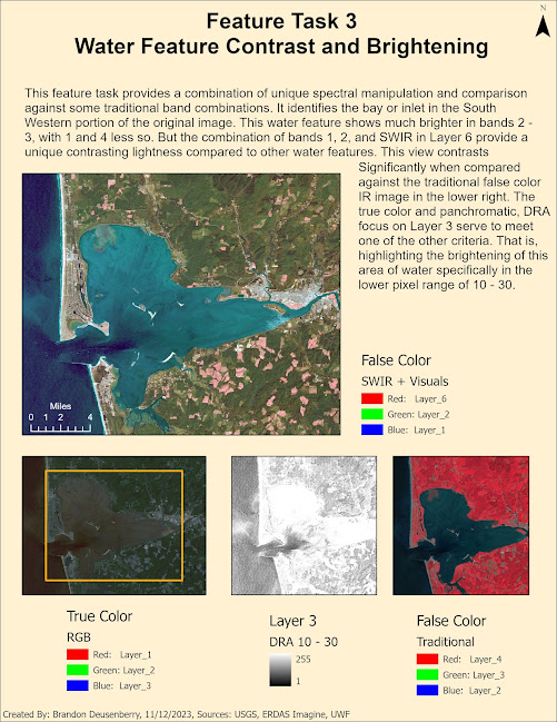
This week's topic revolved around multi-spectral analysis through spectral enhancement. This involved taking existing spectral data and presenting it in a manner that might bring out certain relationships or patterns that might not have been originally obvious. The objective was to study an image set and identify certain spectral relationships by evaluating information available across multiple bands of the same image. Manipulating the pixel values through particular enhancements, and then identifying specific values correlating to specific feature types in the image helped build confidence in both ERDAS Imagine and ArcGIS. Both tools were used to explore the given image. Several tools within ERDAS were used, such as the Inquire cursor to look at particular groups of pixels for their relevant brightness information. Histograms and contrast information were used to identify patterns within multi-spectral and panchromatic views of one or more spectral bands. Specific criteria were provided for us to evaluate the image and locate features that matched. The first criteria involved locating features that correlate to a spike in the histogram data within spectral band 4 in values between 12 and 18.
The last criteria being looked for revolves around water features that when looking at bands 1-3 become brighter than usual, but remain relatively constant in bands 5 and 6.
Monday, November 6, 2023
Module 3, Intro to ERDAS Imagine, and Thematic Mapper Classification
ERDAS Imagine is another one of the primary softwares that we are using within this course. This week was an intro to it, and a look at some practical uses with Landsat Thematic Mapper imagery. Along with the basic ERDAS functionality, I looked into pre-processing an image within on software, then compiling a useable map within another, ArcGIS Pro in this case.
The imagery software was used to organize and display a pre-classified image. In this case, the subject area is in the Olympic National Park area of Washington State. I chose the Mt. Lawson region and derived a subset image from a broader view of the park. The software was used to identify the area in hectares associated with all of the different classification types. Additionally, there were several themes explored while working with this and other images. Specifically looking at how spectral, spatial, and temporal resolution all work with different image types, and even multispectral images allowing for multi-band presentations.
While the above is a relatively simplistic map, the majority of the exploration for this weeks lab was within the ERDAS software itself. Additionally, there was an emphasis on understanding wavelength, frequency, and energy, associated with different portions of the electromagnetic spectrum. A couple key takeaways for this work were that the shorter the wavelength, the higher the frequency. The greater the frequency, the greater the energy.
I look forward to moving into understanding how to do this type of image classification with the software and working to better incorporate multispectral imagery. Thank you for coming along with me.
v/r
Brandon
Monday, October 30, 2023
Pascagoula, Mississippi, Land Use and Land Cover Classification
Hello and Welcome,
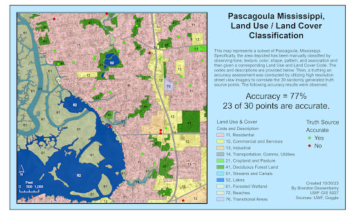
This week covered two interrelated topics. Land use and land cover, and assessing accuracy or truthing for the same. The combined result of which is displayed below. So what happened?
First, with only an image of the Pascagoula area of Mississippi, and a basic understanding of Land Use and Land Cover classification, I digitized the entire image area according to my visual inspection of the land use or cover elements present. Utilizing the tone, texture, shape, size, color, patterns, and associated elements that we discussed last week, I went through and identified the uses of these areas and then gave them the corresponding code, down to the 2nd level of classification. for example, I identified residential areas, but did not sub divide into single unit or multi-unit dwellings. Or, as another, streams and canals were identified, but not specifically, rivers, creeks, rivulets, manmade or natural, etc.
Then, after the entire image was classified according to my visual inspection, I utilized a random point generator to create markers for truthing. Because I could not physically go to Pascagoula and these sites, I utilized Google Street View, in place of an in situ investigation. The sample size was kept at an easily manageable level, only 30 points for training purposes, despite Jensen suggesting a minimum of 50. But for training purposes this allowed me to break out a couple of good datapoints.
There was an overall accuracy of 77% as depicted below, just based on the points used. But some categories like the residential category show in excess of 89% accuracy sense more points were in that category and they appeared to be relatively more accurate. But at the same time, with the random sampling technique, not all categories were included. That is one area for improvement for future truthing, ensuring all categories are sampled.
Above you can see the different usage and cover categories that make up the picture, as well as the truthing points. With more time, we would see a continued expanding of the Land Use / Cover Cateogries, but more specifically, further subdividing into 3rd level categories which would provide a larger nuance to the classification presented here.
Thank you.
v/r
Brandon
Tuesday, October 24, 2023
Visual Interpretation - An Imagery Orientation
Welcome to the first lab of the Aerial Photo and Remote Sensing course. This lab was a combination of 3 interrelated exercises. The first two were variations on a theme, how do you analyze and interpret features within an image.
Utilizing visual tones and textures, we first identify areas that help provide visual contrast throughout the scene. That is the subject of the first map below. This map Utilizes an objective scale for tones transitioning from very dark, dark, medium, light, very light, and then textures from very course, course, mottled, smooth, very smooth. These were done by creating a new feature class and then manually digitizing the polygon containers for the specific features. I also personally feel the harder of the two to prescribe a clean break in scale is Tone. Especially when the entirety of the image is gray scale or panchromatic.
This next graphic is very similar to the one above, but it focuses on visual characteristics broken down into four specific categories to help provide positive feature identification. The categories are shape/size, shadow, patterns, and local association. Examples for each category highlighted below include applying point features to obvious beach buildings based on their rectangular shape. The central water tower is more easily recognized because of the shadow it casts. Likewise, power poles and power lines all cast definitive shadows based on an illumination source to the south, southeast of the scene. For localized patterns the beach neighborhoods, parking lots, and roadways all provide definitive features based on this characteristic. Association is one of the more nuanced concepts, as it relies upon the relationship of surrounding objects or scene. For example, a long rectangular thoroughfare jutting into the water… really can only be a Pier in this context. Also, there are a couple of dark blotches surrounded by buildings or other features serving to highlight this central area. These are swimming pools in a courtyard.
The third portion of the lab was a comparison between a True Color and False Color version of the same image. This exercise was overall less involved in the technical aspects, as it focused on comparing two map frames, one True Color, one False Color, with 5 common reference points described above. The same technical skills as above were applied. Adding undefined imagery, and creating a new feature class, and then locating comparison points.
As an introduction to the differences between True and False color, this exercise served to highlight some broad differences in presentation with simple color band assignment changes. The water, forests, and certain man-made features provided the greatest contrast, often with the False Color causing the features to be more discernible.
The direct side by side of the images is below.
Thank you for your time, look forward to seeing you next lab!
v/r
Brandon
Tuesday, October 17, 2023
Starting GIS 5027 - Remote Sensing
Greetings and hello,
Let's follow on from the successful completion of Intro to GIS and continue this journey with the Aerial Photo & Remote Sensing course. The amount of technical knowledge and increased understanding provided by this course is an excellent accompaniment to my career working as a remote sensing operator. Or more colloquially known as a Sensor Operator within the Air Force. Thanks for coming along with me.
v/r
Brandon
GIS Communications - Lab 6 - Bivariate Mapping
Greetings all! It is absolutely crazy that this is the last module, minus final, for this class! Where did the time go? This whirlwind expe...

-
Greetings and welcome to Lab 5! Interpolation is how we apply values to unknown points based on sample points where we do have known inform...
-
Welcome to Lab 4, discussing one of the most useful and most proliferated (in my opinion) types of thematic maps. The Choropleth map. These...
-
ERDAS Imagine is another one of the primary softwares that we are using within this course. This week was an intro to it, and a look at som...


