Greetings and welcome to module 3.
The lab portion of this module is built around employing the Gestalt Principles of Design. Classically, there are 8 of these, but we will distill them into the concepts outlined below.
1. Intellectual Hierarchy
2. Visual Hierarchy
3. Contrast
4. Figure-Ground
5. Balance
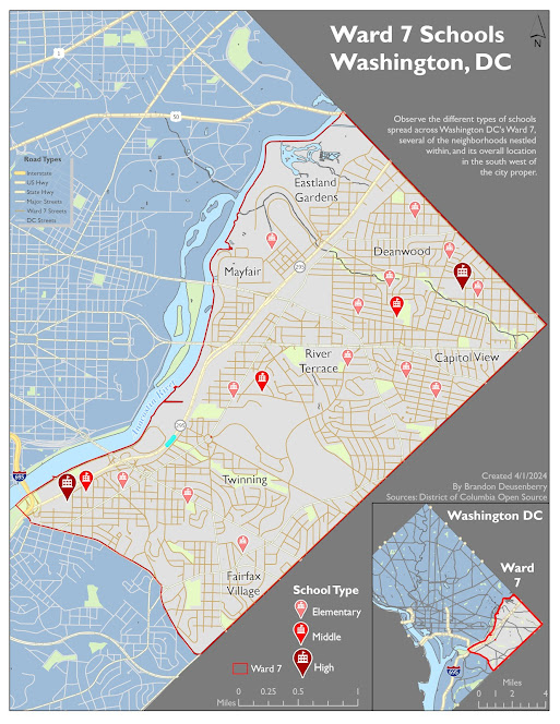
The lab also continues building upon the labeling and organizational elements that were employed in the previous lab. The lab and map shown below were created entirely within ArcGIS Pro with the goal of based employing the principles above. All data was provided, but all design choices were my own.
The subject area for the lab is Washington DC, specifically Ward 7. This war makes up the eastern point of the DC area. The goal was to highlight all schools within Ward 7 and organize them by type. As such you can see elementary, middle, and high schools all distinctively broken out. They are based off the same location pin symbol, but the type of school changes in size and color intensity based on the type of school. High schools are the largest and darkest symbol, whereas elementary schools are the smallest and lightest of the pins. However, taken together they are still more noticeable than background features. This is one example of the features discussed above and further discussed below the map.
I have implemented
visual hierarchy in my map in multiple ways. Chiefly, the most notable features
are the Schools themselves, followed by the distinguishable border for the
subject area. Then I have also applied hierarchical principles to the other
elements such as the Title being most emphasized through size characteristics
and other text items having less emphasis, but still being more visible than
other items. Did you notice the secondary legend for the road types? Its not
absolutely essential nor the focus of the map, but it is present should you be
looking around those areas.
Ward 7 is the figure
to all the other ground around it. Ward 7 is a lighter area on the map, more so
than the rest of Washington DC which is a darker blue, just to break up all
of the gray contrast. And areas outside of Washington are darker still. Additionally,
the subject area streets contrast against the streets outside of ward 7.
For balance note, Ward 7 comes to a point on the East (right) side of the map. This divides and leaves two open triangular background areas for use of ancillary elements. Not that these areas are almost the same size, with a slight favor to the lower right one. I wanted this area to be slightly heavier, adding more gravity to the image, by placing the primary legend and map inset there. But to balance the subtle size difference, the title in the upper right is the largest heaviest font on the page. The focus area is still specifically centered on the page with elements being semi equally distributed around it. The secondary area in the main map which is mostly just Washington Roads, does have a secondary legend which helps provide more usefulness to the area than simply unlabeled cityscape.
Thank you much
v/r
Brandon


No comments:
Post a Comment