Wednesday, January 29, 2025

GIS Communication; Lab 3 - Terrain Visualization

     Wow, it's already been 3 weeks. How does the time go so fast? Welcome to the discussion on terrain visualization. The two different aspects of this visualization that were the focus of this week are contours and hillshading. The purpose of hillshading is to help convey and understand the 3 dimensional aspects of a region. This is predominately achieved by creating a surface with known elevation, be it a digital elevation model, triangulated irregular network, or digital surface model. A hillshade is also created by applying an illumination source on a scene. Normally this source is simulating the sun from a particular azimuth and elevation. The direction of illumination then casts shadows and illuminates the features or topography based on the direction it originated. There are multiple techniques to apply hillshading, from a traditional singular direction, to multi-directional, which is designed to compile multiple views into one scene. 

The map example below is a culmination of multiple different objectives. I utilized a multidirectional hillshade on a TIN of Yellowstone National Park. Overall, I think the multidirectional technique better highlights ridges and valleys oriented in multiple directions than the traditional unidirectional hillshade. That is the underlying layer in the map below. The colors of the main map are based off of a Land Cover Classification for the park. Multiple types of trees and vegetation are identified by their respective color. Non-forested and water covered areas are also identified. The classified raster was provided with more class break outs than are presented here. For clarity I combined like classes of trees, and then adjusted the colors to reflect the areas things were present. The smallest distinct areas have a brighter color to make them still identifiable, and the lower amount of those regions still keeps them fairly mid ground in the visual hierarchy. This Land Cover layer then gets a level of transparency to let the underlying hillshade show through. This combination gives us a more useful look at the topography and gain more meaning into the distribution of land cover classes. 


I think one thing to be aware of is that the greens may not be the best green for their particular vegetation type. But given that they are still revolving around some evergreens and then some seasonal greens I think it is more appropriate to have the majority of the vegetation in like color. Water is of course water colored, blue, which is useful. So what do you think?

v/r

Brandon


Thursday, January 23, 2025

Communicating GIS, Lab 2 - Coordinates and Projections

 Greetings and hello! 

This week we are looking at the effects of different projection methods and systems on map making. First, for those without a GIS background, what is a projection? A projection is a method for transforming the spherical earth into a flat or two-dimensional map. Different projections have different purposes in that they are designed to maintain some aspect of the earth. These aspects include accurate distances, angles, shapes, or areas. Most projections focus on one or two of these aspects, but when talking about multiple, there are usually smaller distortions in all aspects. 

The overall purpose of this weeks lab was to look at these distortions through different example projections, apply common coordinate systems, and experiment with different projection options. This culminated in creating the Grid & Graticule map below. I utilized Nevada based on where I am currently living. Using it as a study area, I found a Nevada specific projection when encompasses the entirety of the state. 

Interestingly, Nevada has its own projection, called the Nevada State Reference System (NSRS) of 2007. This is a UTM projection and aligns with UTM Zone 12N because the East – West boundary lines of Nevada correspond with that UTM Zone.This is a better choice than the State Plane system because Nevada has 3 State Plane Zones. They are the East, West, and Central zones. For a full state presentation as seen below, UTM Zone 12N is appropriate. There are two datum options that could be utilized however. The NSRS is as of 2007, but there is a UTM 12N with NAD 1983 or 2011 options. I elected to go with the state-specific option for the subsequent map. 


Note the multitude of intersecting lines in this map. What are they? The blue lines represent the Projected Coordinate System and are displayed as a "measured grid." That is a grid that shows measurements on the map based on the values associated with the coordiante system. In this case they are in Meters to go along with the UTM zone. The tan lines on the other hand are for the Geographic Coordinates, and represent a 1 degree interval and are referenced in terms of latitude and longitude. 

While this was a specific application of a projection and grid/graticule, the rest of this lab looked at everything from different whole world presentations to regional specifics. While this hasnt been the first of my GIS classes to look at projections I think this has been the most indepth manipulation and the best overall understanding of how to use them. For that, its an invaluable lab.


v/r

Brandon

Friday, January 17, 2025

GIS Communications, Typography Lab 1

 Greetings! 

Welcome back to the GIS Journey as we kick off our time in GIS 6005 - Communications. Lab 1 focuses on cartography, the basic map elements, and typography. This is an excellent refresher from some of the early GIS courses, and gives renewed focus on the map design principles, and typographic styling. I think that typography is one of the ways to truly define your presentation style. While I dont think I have fully come close to fully defining mine yet, the exercises highlighted below are certainly a step in that direction. Overall, the purpose of the below were to explore techniques for manual and dynamic labeling, and implementing effective design choices. Those design choices need to enable the map to be legible, have visual contrast, deliberate hierarchy, solid figure-ground relationships, and ultimately - balance. 

To that end, the two examples below focus on utilizing a hierarchy to the labeled elements through use of size changes, bolding, italics, font color differences, and positioning. By being able to separate out differences in feature category or feature hierarchy we can help build a more effective map, and this lends to improved visual balance. 

This first example looks at San Francisco and highlights a number of different types of features throughout the city and around it. There are only 16 labeled features on this map, but there is still a deliberate difference in the hierarchy and presentation of the different labels. 


This second example looks at Mexico and balances 3 different types of labels across the whole country. Prominent cities, rivers, and state names are all on display. This is a much more busy map by design, but still, deliberate design choices were applied to each of the label types. From differences in text size, bolding, color and contour differences, the tree types all stand out in different ways. The rivers flow near or along each of their respective rivers. The Cities are tied to representing points, and the states are overall smaller but centered to the max extent able. 


While I think this is still really busy of a scene, I did refine a lot of the goals on placement. With more time I think there could be a good deal of streamlining of the river labels, but for now, it was a great exercise in remember how to manipulate these elements in Arc GIS Pro. 

Thank you! 

v/r

Brandon  


Sunday, October 6, 2024

Special Topics - Mod 3 - Lab 6 - Aggregation and Scale

 Hello and Welcome back! 

My how time has flown. It has almost been 8 weeks, and 6 different labs. There have been so many topics covered in this short time, and here we are hitting on a combination of new and reinforcing of previous once more. 

This final module for Special Topics focuses on how scale and resolution affect vector and raster data respectfully. The overall theme there is on observing some effects with the Modifiable Area Unit Problem (MAUP). That refers to the issue that comes up when reviewing spatial analysis results of a data set across varying scales or changes in size, shape, or boundary of some spatial unit. This leads to the possibility of interpreting the same dataset multiple ways depending on the enumeration unit used. Finally we end that discussion with the ultimate form of boundary manipulation used for political boundaries, gerrymandering. 

A little back to the basics, Scale refers to the overall detail present in a map or scene. Large scale references a higher amount of detail over a smaller geographic area. Conversely small scale is a much broader area with less detain. The larger the scale the more detail we have, the more data and true surface information maintained. 

Resolution for raster data refers to the size of each pixel. The size of the pixel affects the level of detail. Generally put, an object must be larger than the minimum resolution (pixel size) to be distinguishable in a raster image. Again, high resolution has more detail but usually represents a smaller ground area. This does come with the tradeoff of needing much more processing power and digital storage capacity. 

Gerrymandering on the other hand refers to the adjustment of electoral district boundaries to favor a particular party. Its overall goal is to influence election outcomes in that particular district, by having the majority demographic grouped together. There are numerous ways to try to determine the degree to which a district is or isnt gerrymandered. for this module I took two different approaches. I calculated the Polsby-Popper and Reock Compactness scores. They both have a unique formula relating to the area and perimeter length of a congressional district. 

Polsby Popper = 4π × Area​ / Perimeter2

Reock = Area of District / Area of the Smallest Enclosing Circle

These both focus on comparing the area or perimeter of the district to a similarly sized or enclosed circle. Polsby-Popper looks at a circle of the same perimeter size, and Reock looks at the smallest circle that can hold the district area.

Computationally I was able to do all of the Polsby Popper calculations within a modified Congressional District feature class. The primary modification was to only include the continental United States. The Reock computation involved creating a new feature layer by use of the Minimum Bounding Geometry tool. This tool took all of the data from the District feature and created the smallest circle corresponding to the size of the representative district polygon. From there, the circles area was divided into the district area for comparison. The image below shows some of the "worst offenders" for the Polsby Popper Score. 


This look at the South Eastern United States has 3 different Red areas were were the Top 3 worst scores. 


Here is a zoomed in look at the #3 offender, specifically highlighted because it falls within our very own Florida. You can see that this district covers an area from Orlando to Jacksonville. It also doesnt take a direct path to get there between the two. While the coastal districts are a little more regularly shaped, they are not without impact from Gerrymandering. They too likely have the opposite demographic indicators of this particularly highlighted district. 
Ultimately Gerrymandering is a deliberate manipulation of the political system, but it can be measured and analyzed, thats what the above serves to do, by having applied the same calculation to every district, then excerpting some of the lowest scores. 

It has been a wonderful class, and doesnt feel like this ones concluding. What does that ultimately mean? That even more learning is to come as we jump into the true masters portion of the courseware. Thank you for joining me. 

v/r

Brandon


Sunday, September 29, 2024

Special Topics - Mod2.2 - Lab 5 - Interpolation

 Greetings and welcome to Lab 5!

Interpolation is how we apply values to unknown points based on sample points where we do have known information. These values are predictions based on what we do know. Several different methods of interpolation focus on different statistical or geometric calculations. We will discuss a few of them as they were applied to this week's lab. 

 Thiessen Polygons: these polygons represent an area in which all points contained are measurably closest to the representative data point contained within them. That is, all areas are physically closest to this sample data, not any other sample points. This is a nearest neighbor style analysis.

Inverse Distance Weighting (IDW): this method applies greater weight to nearby points than farther points. This assumes through spatial autocorrelation that a point closer is more alike than those farther. One problem is that it may not capture local variations depending on the effective distribution of the data. 

Spline: This method fits a line through all of the data points present in the set. It seeks to minimize the curvature of the surface, and is good for trying to represent gradual transitions. It can overshoot areas with abrupt changes, but as seen below can present a smoother surface between less harsh phenomena. 

These are only a few of the possible interpolation methods, and are the primary ones discussed in this lab. They were all used to look at a fictitious sample data set for a real place. Specifically, we are looking at points across Tampa Bay to measure Biochemical Oxygen Demand (BOD) in milligrams per liter (Mg/L).

Here is a look at two of the primary methods and how they visually compare: 

IDW:


The thing that I dont think is modeled well by this approach are the Green areas. That is, those areas with a lower concentration.  They are more like localized Low points, when I think they should be more of a balance and transition between the higher areas and lower. That is one thing that is captured better below in my opinion.

Spline: Regularized. 


While also not perfect, I think this presentation does a better job at highlight the transition in zone types. However, it may have missed larger areas that still have a high BOD concentration. 
Regardless, both of these are two different approaches with the same dataset. They seek to estimate the values for areas outside of the measured points. 

This lab further continues to solidify the importance of good sampling methodology. And really we only talked about a few methods, there are so many other choices with varying degrees of difficult calculations included. But as a taste for interpolation it is definitely interesting to see how much the same data set can vary by different presentation models. 

v/r

Brandon

Sunday, September 15, 2024

Special Topics - Mod 2.1 - Lab 4 - Surfaces

 Hello and welcome to the second module for Special Topics! 

In these next two lab weeks we will be looking at Surfaces. This week specifically we are looking at actual ground surfaces through a couple of different tools. Specifically, we are using Triangular Irregular Networks and Digital Elevation Models and comparing similar continuous phenomena with them. In previous classes, we have looked more extensively at DEM's, so for now I will do a little more look at TINs. But first a quick look at what we are working with this week.

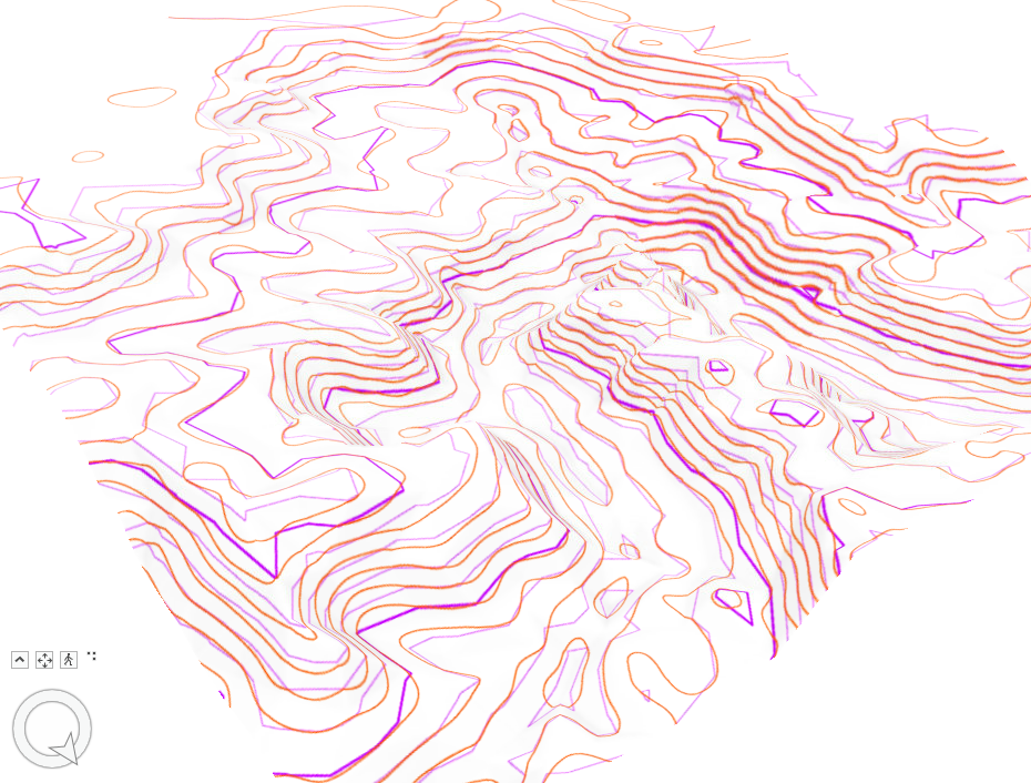
There were four different parts of this week's lab which all built on each other. Each part helped build a better understanding of 3d visualized terrain elevation information. It culminated in taking a set of points with elevation (z) information associated. The same set of points was used to create contour lines by first generating a TIN and second generating a DEM. There are a few keys to remember when working with point data like this. 

There are point density considerations, particularly based on the amount of change over the study area. Dr. Morgan simply put, the more points the better (in general). Despite that, more doesn't always matter. It is more appropriate to increase your point density relative to the amount of change in your study area. Flatter areas or those with little terrain variation require fewer sample points to maintain accuracy. More variable terrain or areas with steep changes (mountains, valleys, cliffs, peaks) need a higher point density to retain accuracy. The more sample points in this case let the TIN capture more variations in elevation. Another key point is the idea of critical points. Focusing on critical points like peaks, ridges, and depressions allows a more efficient usage of points than just a consistent distribution of points. 

DEM Elevation and Contour Lines: 


TIN Elevation and Contour Lines:


Overlaps in the two derived contour lines: 


Purple / Light Purple: Index Line and Regular Contour for the TIN

Brown/Orange: DEM Contour line

The biggest difference between the two sets of contour lines is that the DEM derived lines are much smoother. The TIN derived lines have much more straight edges and corners for direction shifts. This makes sense, since the TIN is as its name implies, triangular. This gives them a harder, more angular presentation, compared with the smooth rounded DEM contours.  The lines appear to be most similar, or have limited variation in the steeper transitions. But some of the most noticeable shape differences are on the peaks and in the valleys. But there are some instances where it looks like some lines on the TIN jump from one layer to the next, which is not as much the case with the DEM lines. 


v/r

Brandon


Sunday, September 8, 2024

Special Topics - Lab 3 - Network Assessment

 Hello and welcome to Lab 3. This is the culmination of module 1, which explores the interrelated topics of standards, accuracy, precision, and finally a cumulative assessment. This lab evaluates the completeness of two different road networks covering Jackson County, Oregon. 

The two road networks being assessed are from two different sources. The area standard comes from the Jackson County GIS team and will be referenced as the Jackson Centerline feature. The comparison feature is a TIGER 2000 road layer. The assessment of these two features follows Hacklay's (2010) approach discussed in the article "How good is volunteered geographical information? A comparative study of OpenStreetMap and Ordnance Survey datasets" published in Environment and Planning B: Planning and Design 2010, volume 37, pages 682 - 703. 

Following that study there are two basic assessments: first, a simple length comparison of the two features. Completeness in that case is defined as whichever feature has greater length, which came from summarizing the total length of each segment. For the total county, the results were as follows: 

Jackson Centerline: 10,786.5 Km 
TIGER 2000: 11,253 Km

In this case, the TIGER network appears more substantive across Jackson County. 

The second assessment is a little more involved. following Hacklay, a Grid was applied to the County, specifically 297 5x5 Km grid cells. Both road networks were clipped to the grid, and then I determined the total length per cell. This allowed for each cell to be compared for individual completeness and a percentage difference between themselves. Interestingly, when only looking at the grided area, the summary results changed:

Jackson Centerline: 10,671 Km
TIGER 2000: 9,925.7 Km

Following Hacklay's presentation, the cells were determined as follows. 

Cells

Area

Jackson More Detailed (Longer)

163 of 297 cells = 55% or 4,075 SqKm

TIGER More Detailed (Longer)

123 of 297 cells = 41% or 3,075 SqKm

Cells approximately equal

11 of 297 cells = 4% or 275 Sqkm


While the procedures are discussed more in the map, the basic purpose of the grid is to highlight the percentage difference or length difference between the two layers. This was definitely an intensive amount of transformations of the original data and joining the results with the grid. This was a good culmination of all of the previous labs, looking at data accuracy, precision comparisons, and network completeness. Thank you.

v/r

Brandon

GIS Communications - Lab 6 - Bivariate Mapping

 Greetings all! It is absolutely crazy that this is the last module, minus final, for this class! Where did the time go? This whirlwind expe...