Sunday, September 29, 2024

Special Topics - Mod2.2 - Lab 5 - Interpolation

 Greetings and welcome to Lab 5!

Interpolation is how we apply values to unknown points based on sample points where we do have known information. These values are predictions based on what we do know. Several different methods of interpolation focus on different statistical or geometric calculations. We will discuss a few of them as they were applied to this week's lab. 

 Thiessen Polygons: these polygons represent an area in which all points contained are measurably closest to the representative data point contained within them. That is, all areas are physically closest to this sample data, not any other sample points. This is a nearest neighbor style analysis.

Inverse Distance Weighting (IDW): this method applies greater weight to nearby points than farther points. This assumes through spatial autocorrelation that a point closer is more alike than those farther. One problem is that it may not capture local variations depending on the effective distribution of the data. 

Spline: This method fits a line through all of the data points present in the set. It seeks to minimize the curvature of the surface, and is good for trying to represent gradual transitions. It can overshoot areas with abrupt changes, but as seen below can present a smoother surface between less harsh phenomena. 

These are only a few of the possible interpolation methods, and are the primary ones discussed in this lab. They were all used to look at a fictitious sample data set for a real place. Specifically, we are looking at points across Tampa Bay to measure Biochemical Oxygen Demand (BOD) in milligrams per liter (Mg/L).

Here is a look at two of the primary methods and how they visually compare: 

IDW:


The thing that I dont think is modeled well by this approach are the Green areas. That is, those areas with a lower concentration.  They are more like localized Low points, when I think they should be more of a balance and transition between the higher areas and lower. That is one thing that is captured better below in my opinion.

Spline: Regularized. 


While also not perfect, I think this presentation does a better job at highlight the transition in zone types. However, it may have missed larger areas that still have a high BOD concentration. 
Regardless, both of these are two different approaches with the same dataset. They seek to estimate the values for areas outside of the measured points. 

This lab further continues to solidify the importance of good sampling methodology. And really we only talked about a few methods, there are so many other choices with varying degrees of difficult calculations included. But as a taste for interpolation it is definitely interesting to see how much the same data set can vary by different presentation models. 

v/r

Brandon

Sunday, September 15, 2024

Special Topics - Mod 2.1 - Lab 4 - Surfaces

 Hello and welcome to the second module for Special Topics! 

In these next two lab weeks we will be looking at Surfaces. This week specifically we are looking at actual ground surfaces through a couple of different tools. Specifically, we are using Triangular Irregular Networks and Digital Elevation Models and comparing similar continuous phenomena with them. In previous classes, we have looked more extensively at DEM's, so for now I will do a little more look at TINs. But first a quick look at what we are working with this week.

There were four different parts of this week's lab which all built on each other. Each part helped build a better understanding of 3d visualized terrain elevation information. It culminated in taking a set of points with elevation (z) information associated. The same set of points was used to create contour lines by first generating a TIN and second generating a DEM. There are a few keys to remember when working with point data like this. 

There are point density considerations, particularly based on the amount of change over the study area. Dr. Morgan simply put, the more points the better (in general). Despite that, more doesn't always matter. It is more appropriate to increase your point density relative to the amount of change in your study area. Flatter areas or those with little terrain variation require fewer sample points to maintain accuracy. More variable terrain or areas with steep changes (mountains, valleys, cliffs, peaks) need a higher point density to retain accuracy. The more sample points in this case let the TIN capture more variations in elevation. Another key point is the idea of critical points. Focusing on critical points like peaks, ridges, and depressions allows a more efficient usage of points than just a consistent distribution of points. 

DEM Elevation and Contour Lines: 


TIN Elevation and Contour Lines:


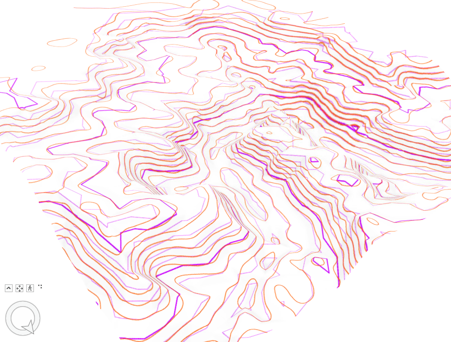
Overlaps in the two derived contour lines: 


Purple / Light Purple: Index Line and Regular Contour for the TIN

Brown/Orange: DEM Contour line

The biggest difference between the two sets of contour lines is that the DEM derived lines are much smoother. The TIN derived lines have much more straight edges and corners for direction shifts. This makes sense, since the TIN is as its name implies, triangular. This gives them a harder, more angular presentation, compared with the smooth rounded DEM contours.  The lines appear to be most similar, or have limited variation in the steeper transitions. But some of the most noticeable shape differences are on the peaks and in the valleys. But there are some instances where it looks like some lines on the TIN jump from one layer to the next, which is not as much the case with the DEM lines. 


v/r

Brandon


Sunday, September 8, 2024

Special Topics - Lab 3 - Network Assessment

 Hello and welcome to Lab 3. This is the culmination of module 1, which explores the interrelated topics of standards, accuracy, precision, and finally a cumulative assessment. This lab evaluates the completeness of two different road networks covering Jackson County, Oregon. 

The two road networks being assessed are from two different sources. The area standard comes from the Jackson County GIS team and will be referenced as the Jackson Centerline feature. The comparison feature is a TIGER 2000 road layer. The assessment of these two features follows Hacklay's (2010) approach discussed in the article "How good is volunteered geographical information? A comparative study of OpenStreetMap and Ordnance Survey datasets" published in Environment and Planning B: Planning and Design 2010, volume 37, pages 682 - 703. 

Following that study there are two basic assessments: first, a simple length comparison of the two features. Completeness in that case is defined as whichever feature has greater length, which came from summarizing the total length of each segment. For the total county, the results were as follows: 

Jackson Centerline: 10,786.5 Km 
TIGER 2000: 11,253 Km

In this case, the TIGER network appears more substantive across Jackson County. 

The second assessment is a little more involved. following Hacklay, a Grid was applied to the County, specifically 297 5x5 Km grid cells. Both road networks were clipped to the grid, and then I determined the total length per cell. This allowed for each cell to be compared for individual completeness and a percentage difference between themselves. Interestingly, when only looking at the grided area, the summary results changed:

Jackson Centerline: 10,671 Km
TIGER 2000: 9,925.7 Km

Following Hacklay's presentation, the cells were determined as follows. 

Cells

Area

Jackson More Detailed (Longer)

163 of 297 cells = 55% or 4,075 SqKm

TIGER More Detailed (Longer)

123 of 297 cells = 41% or 3,075 SqKm

Cells approximately equal

11 of 297 cells = 4% or 275 Sqkm


While the procedures are discussed more in the map, the basic purpose of the grid is to highlight the percentage difference or length difference between the two layers. This was definitely an intensive amount of transformations of the original data and joining the results with the grid. This was a good culmination of all of the previous labs, looking at data accuracy, precision comparisons, and network completeness. Thank you.

v/r

Brandon

Monday, September 2, 2024

Special Topics - Lab 2 - Accuracy Reporting

 Welcome to Lab 2!

This week carries on where last week left off still looking at data accuracy and standards. This week we branch a little deeper into the two types of standards that we could generally be looking for. First, are the National Map Accuracy Standards  (NMAS) of 1947, which were geared more toward printed maps. This standard revolves around allowable positional errors for the maps features, with 90% of well-defined points expected to fall within a map-scale-based tolerance. This standard while still applicable to many printed charts/maps has generally been replaced by the National Standard for Spatial Data Accuracy (NSSDA). This is the current standard which provides a statistical framework for assessing positional accuracy. It uses Root Mean Square Error (RMSE) to quantify how closely the data aligns with actual or true geographic positions. It reports accuracy at a 95% confidence level, which takes either a horizontal or vertical RMSE and applies a statistical multiplier. This approach is more consistent and flexible for digital mapping than the previous standard. 

For this weeks specific project, we looked at two different roads feature classes for Albuquerque, New Mexico. One, provided by the city GIS team, is supposedly the higher resolution standard for the city. The other is a separately provided road network. Both of these were tested against user (my) derived intersection points from 2006 based digital orthographic quarter quad imagery. 


The image above shows the base road network and the sample points which align to intersections throughout the study area. These intersections were then used to compare the reference point, to a point derived from the intersection of the road features polylines, converted to a point. The measured difference in points is used to determine a sum, average, and RMSE. A sampling of the point analysis calculations is below.

The calculations for the full data set result in a set of statistical measures seen below. While the units arent pictured below, remember we are working in feet, based off of the projected coordinate system in use. 


The last thing we do with these calculated results is report it in a semi-standardized method based on the NSSDA. My derived statements for which are below. There is a short statement which could suffice for some reports, or a more in depth detailed statement. I offer both below. 

Horizontal Positional Accuracy (Basic Statement – ABQ Street Data)

Using the National Standard for Spatial Data Accuracy, the City of Albuquerque’s ABQ_Streets data set tested 19.74 feet horizontal accuracy at 95% confidence level.

Horizontal Positional Accuracy (Detailed Statement – ABQ Street Data)

The intersection centerline accuracy of the Albuquerque Street dataset provided by the city of Albuquerque GIS Team was evaluated against a random sampling of intersection center points. The centerline points were observed and derived from 2006 Digital Orthographic Quarter Quad imagery for the study area. This accuracy assessment served to validate the ABQ-Street data as a baseline “high-accuracy” dataset with which to compare other datasets against. The NSSDA accuracy of which was tested at 19.74 feet horizontal accuracy at 95% confidence level.

This was determined through twenty intersections approximating equal spacing throughout the study area. These were adjusted to ensure that the reference sampling points would be applicable to two different street layers, the one discussed here, and a secondary discussed later. Taking the approximate centroid of the selected intersection a new point was derived, and compared against the intersection terminus of the ABQ-Street file, as defined by the intersection vertices transformed to a point feature. The imagery derived reference point and ABQ-Streets derived intersection points were then compared and utilized for the accuracy assessment.

The positional difference in easting and northing was calculated with the results garnering the sum, average, and Root Mean Square Error (RMSE). Following NSSDA guidelines, the RMSE was adjusted to 95% confidence utilizing a multiplier of 1.7308. See the tabular output above. 

Thank you,

Brandon


Special Topics - Mod 3 - Lab 6 - Aggregation and Scale

 Hello and Welcome back!  My how time has flown. It has almost been 8 weeks, and 6 different labs. There have been so many topics covered in...